Showing posts with label #WorkingMethods. Show all posts

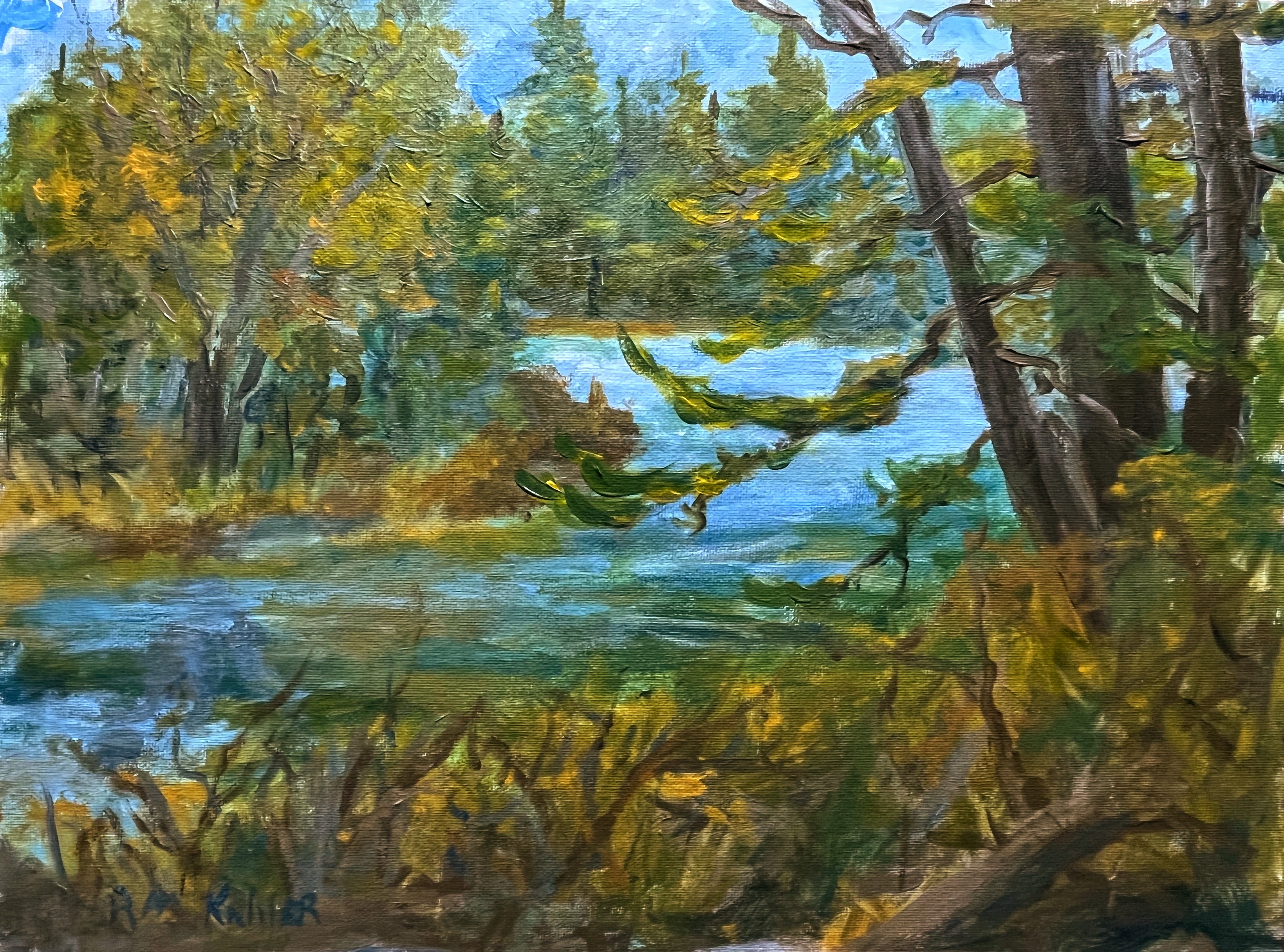
Time Lapse - Beaver Pond Reflections


Time Lapse Video (First attempt so pardon the quality) of blocking in Beaver Pond Reflections


First pass complete - 45 minutes in


Final Painting


Beaver Pond Reflections


Beaver Pond Reflections - Crawford Maine
Acrylic 12" x 16"


Below left was the painting before final adjustments for color and composition.  Subtle differences in the height of the background trees.  I developed the trees on the island and the shape of the island a bit more and, lastly, added some detail and color contrast to the pond, reflections, and foreground.

I particularly enjoyed painting the foreground.  When exploring the Maine streams and woods in the summer or fall, you will often see trees and driftwood deposited by the spring runoff  high among trees or high up on river banks.  That was the inspiration for the tree in the lower right foreground.   A small thing, an incidental accident, almost unconscious but as soon as I made the first brushstroke - there it was.  


The other challenge I run into when painting is to find the proper balance of detail and impression.  I prefer letting the imagination fill in detail whenever possible.

While reading a book of Rusty Heurlin's with his notes in the margins - he had underlined and noted the importance of simplification in his work.  "Simplify, Simplify, Simplify....   Put in only what is necessary in a picture and no more."

Easier said than done but the experimentation is fun and remember - there is almost nothing that can't be undone!


Process versus Spontaneity


Acrylic 12" x 16"

This is an update on the progress of Beaver Pond - Crawford.   This represents about 45 minutes of work with Acrylic directly on canvas to block in the composition and then about 10 minutes on another day to begin to zero in on correcting colors.  (2nd pass)

My favorite type of painting remains on location painting, starting and finishing in one session - generally about two to two and a half hours.  However,  when I don't have the time to paint on location I'll use on location sketches and trips as inspiration.  I've documented this elsewhere if you are interested.

In general my method in these types of cases for acrylics is

Compositional Sketches (very loose - mostly line drawings)
Larger Charcoal Sketch to work on values

Then onto working with Paint:

1st Pass  Covering the Canvas in Paint
                    Blocking in the composition rapidly
                    While attempting to get colors and values correct at this stage - but 
                     not worrying if the colors are off 

2nd Pass  Fine tuning painting for both color and composition

Set aside for a few days (or months or years in some cases)

3rd Pass (if painting is not completed) further refinement


I resisted developing a system or process for years.  I just wanted to get out and paint.  While that helped me develop as an artist in many ways, it was also frustrating for me as I often spent as much time searching for what I needed, often wasting what little time I had for painting.  

I've slowly come to realize that even on a day when nothing goes as planned with a painting, if the results are horrible and in no way reflect what I am trying to capture - it's fine.  I still have learned something.  

It took me years to establish a system that works for me with the time I have that still allows me to maintain a sense of spontaneity and excitement when I'm painting.

I also have a "go bag" (three actually) for Watercolor, Acrylic, and Charcoal in addition to my main paintbox which I will switch out between all of the above and oil paintings.


With All Thy Might


With All Thy Might
Acrylic 12" x 16"


I enjoy times at the coast when the weather is such what the roar of the ocean and wind drown out the concerns of the day.  These walks and painting sessions bring to me a deep sense of peace that is both as indescribable as it is increasingly rare in the frenetic pace of our daily lives

This subject, like many of mine, is a combination of a number of places along the Maine Coast and it's islands.  The bulk of the painting was completed in one day.  I'd really been fascinated with the ever changing cloud formations.

The original pass at this subject is below.   I knew that the wave was not correct, but I wasn't sure what I wanted to do with it - so I simply set it aside..


Sometimes the time in between first pass and second is less than a day.  At other times - years.  In this case it was the latter.  

I added more movement to the wave, with the center pushing forward more quickly.  I also added a little more contrast to the tall grass and a few hangers on - leaves on the saplings.  I'm always amazed how nature finds a way - in this case a few leaves in an exposed wind and surf driven spot remain attached even through the first snow.

.
#robertkahlerlandscapepainting,#acrylic, #maine, #ArtForSale, #WorkingMethods, #seascape

Eastport Shades of the Past


Shades of the Past
Gouache on card stock

I've been experimenting with small painted sketches, working out different ideas for subjects including utilizing differently cropped perspectives which keeps the subject focused yet implies a lot of distance outside of the view.

This scene was taken from an on location watercolor I completed a few summers ago in Eastport, ME.  I was struck by the play of shadows on the sunlight face of an abandoned factory just off main street.

As a student of history, I could just imagine the harbor filled with three and four masted schooners in its heyday and I decided to alter the pattern of the shadows on the factory to represent that history.


#robertkahlerlandscapepainting #workingmethods #sketchingwithpaint #eastport #maine


Small Seascape


Seascape 
Acrylic 3" x 5"

While doing some detail work on a larger seascape, I began working on some small paintings for a couple of reasons.

For one, I don't like focusing for a long time on small detail work, so I need to break things up.  Also, the yankee in me hates to waste any paint.  If I have paint left over I try to do a small painting - like the one above.  If the paints do not lend themselves to a monochrome or a painting like above, I will use it to put a first coat on a canvas if I have any about.

Below are a few other examples of smalls.  Some of which will be simple studies and abandoned.  Others will lead to other painting journeys.  All, good or bad, complete or incomplete, do help inform my future paintings.  Any day painting is a good day!


Lessons Learned - Is your painting complete or it it finished?

Ammonnoosuc River - Watercolor on Paper

I did some detail work on my large watercolor of the Ammonnoosuc River in Northwestern New Hampshire.  On the lower left, was the early pass at the subject.  I will, from time to time, revisit a subject.  As I had left the picture, it struck me as close to what I was trying to achieve, but overall too dark.  It was accurate feel for the day and time, but the river didn't match the sky.  I decided to just leave things as they were for the time being to get some distance.  Often in Nature - there are times and locations that are quite interesting and moving, but they don't necessarily translate into a strong composition or painting without some artistic license.

There were parts of the picture that seemed flat to me, not enough of a difference in value.  I wanted to increase the interest throughout the picture while not confusing the eye with too much detail.  I remember vividly my first art show many years ago.  I was not really ready to show - but I went for it anyway.  

I walked the grounds and viewed the works of other artists and I found myself to be exhausted by the end as I was focusing on every detail I could.  I didn't really understand the lessons I was learning at the time.  The eye is naturally drawn to detail.  How to balance detail with leaving much up to the viewers imagination?

Years later I went to an exhibition of NC Wyeth, Howard Pyle, and Andrew Wyeth at the Farnsworth in Rockland, Maine.  It was a breathtaking exhibition and really a master class on both composition and using, or avoiding, detail to draw the viewers eye to the intended center of interest.  What I noticed immediately was that these paintings were at once very dramatic and moving, yet very "relaxing" to view.  I wasn't searching the center of interest - it was clear in each and every painting.  It wasn't really until the second or third pass through the exhibition that I began to notice the areas of a painting that were merely indicated with a minimum of brushstrokes and subdued values.

    
I brightened the sky to bring it into line with the river in the mid ground and darkened the water in the shadows in the foreground. and I also did some more variances in value throughout all the areas of the picture to add depth and interest.

            
       Detail Left                                       Detail Center                                      Detail Right

I also added some shadows to the rocks in the foreground and added more variance in the values on the small island.  It is a challenge to know when enough is enough with any subject.  Sometimes one brushstroke can be just what a painting needs to bring it to life, or it can ruin a subject.  As Bob Harris (Robert George Harris (1911-2007) Artist and Illustrator) advised me: 

"It's important to know when a painting is done before it is finished!"

None of this is meant in any way to detract from interest or pursuit of highly detailed paintings or Trompe l'oeil paintings.  Those types of paintings are simply not an area of interest for me - at this time.  I do believe that every type of painting, every attempt, informs my work on my next painting.  If you can express what you want to - what moves you, I don't believe that there is a "wrong" way to approach that painting.  


Rocks and Wildflowers


Rocks and Wildflowers
Two lights 
Acrylic 12" x 16"

This is my latest Acrylic Painting of a composition that is a common sight in and around Two Lights.  I explained the process to this point in another post if you are interested in learning about methods for creating painting.  Below I've put the large charcoal drawing (12" x 18") side by side with the Acrylic


When I had reached a stopping point in the main painting, I decided to quickly sketch out some other ideas from my trip with leftover paint on 4" by 6" note cards.


Sketch " x 6"

I really enjoy these quick sketches.  I learn a lot from them with very little time invested.  For instance, in the painting above, the ocean seems to "run off" the picture to the left.  Through the placement of rocks or shrubs I will reverse that so that it leads the eye into the painting and not out of it.  It's a win win.  I don't waste paint and I get to explore ideas in a much looser manner.

Surf Sketch 4" x 6"

Scale of Sketches

Two Lights, Cape Elizabeth


Comprehensive Charcoal Drawing
Between the Rocks and Sea
Two Lights Cape Elizabeth
12" x 18"

Although I don't have  any single process for creating a painting, this subject has progressed in a fairly typical way of late.  Spending time on location is always motivating.  I make a number of quick notes and sketches on note cards in addition to simply spending some time walking a location and observing.  I've begun using note cards for these sketches as they fit into a travel kit very easily.

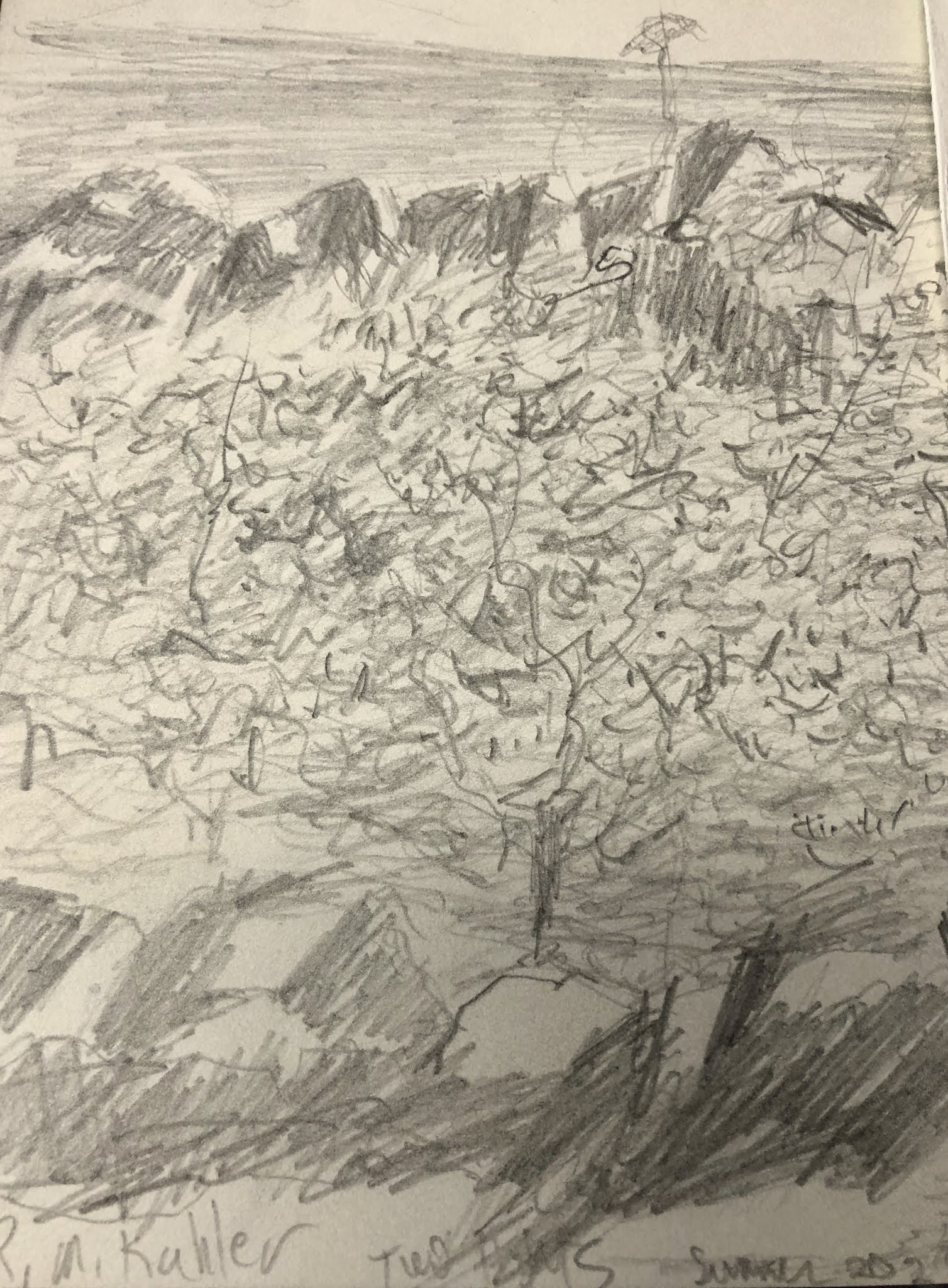
Pencil notes from direct observation 4" x 5"

I then review a number of sketches and decide which subject to elaborate.  See below.

Pencil Comp Sketch
8" x 11"

Years ago I had a happy accident when looking through some old sketches - they were on top of one another and at times created new and interesting compositions.  So I now will intentionally crop drawings to examine other possibilities.  When I'm on location, its still easy for me to get caught up in the scene and not seeing things from a perspective of composition.


When examining the two halves of the picture - I immediately settled on the right side of the composition as much stronger the whole composition as originally sketched.  The left side of the composition seemed much too static when viewed in this manner.

I plan to execute a number of paintings from this drawing including watercolor, acrylic, and oil.  I enjoy exploring different media as the unique qualities of each capture different elements of nature. 


Is it Done or Is it Finished?


These two photos of two of my most recent paintings give a better sense of the size of the water color sketches to the finished work.   For these two acrylics, the sketches are about 1/4 the size of the finished work.

With the large watercolor I did  of the Amonoosuc River, the ratio was more like 7 1/2 to 1.  At this point, I don't do a detailed scale down or up from sketch to finished painting, it is more just a part of the process.  Trying to keep this as simple as possible for quick and efficient sketching in an attempt to capture the moments which catch my attention.

I'm quite motivated by the idea of capturing the different moods of a subject, and even imagining them based on earlier observations of nature.  Both of these paintings are realistic subjects - they do exist, but in imaginary perspective for the old mill pond, and imaging a winters evening full moon light at a local farm.   I really enjoyed these different exercises in the studio.  Working on location remains my first joy in painting, but studio work is gaining in its standing and enjoyment for me.  

I also try to keep the advice of two well known and highly successful artists front and center as I paint.  John Stobart advised putting only as much detail into a sketch as would be needed to execute a finished painting later.  This was to avoid "copying" even one's own work and maintaining room for the spark of creativity.

The late Bob Harris (Robert George Harris) was very encouraging to me through our correspondence and phone calls.  One of my favorite quotes of his is:  "It's important to know when a painting is done before it is finished."  

I also remember vividly the original illustrations by N.C. Wyeth and Howard Pyle on display at the Farnsworth Museum in Rockland, Maine.  The paintings were monumental in scale, composition, color, and use of limited detail.  They knew how to lead your eye where they wanted it to go.  A large area of background scumbled in with virtually no detail in no way diminished these paintings.  On the contrary, the contrast made the paintings even more powerful.  You really had to be on the lookout to even notice these techniques.


Early Spring Evening

Early Spring Evening
Acrylic on Canvas Board
12" x 16"

This is the first studio evening painting I've attempted.  I enjoyed the challenge of muting the colors down, while still capturing the sense of atmosphere on a moonlight night reflecting off the silo, house , and late spring snow.

The inspiration for this painting is a farm I pass by daily on my way to work.  The elements of this painting are all there, just not in the location that I've included them.  I've included a couple of water color sketches below which were the beginnings of working out ideas for this painting.


The watercolor sketch on the left was impression one of a scene toward dusk.  The sketch on the right was a second iteration, which moved the trees behind the house to add emphasis to the house.  I was also experimenting with corn in various stages of decay in the foreground.  

Just quickly looking at these sketches, I can easily see 4 to six different paintings, including a night scene with the snow - which is what I decided to paint.  Below is the first block in, where I was trying to accomplish two things.  One, not to waste paint from another painting I'd just finished (The Yankee in me) and to cover the canvas to make it more workable.  Two I wanted to rough in the composition.


I didn't attempt to block in the tones of evening in the sky, in part, because my one attempt at painting at night (so far) proved to be too dark when examined in the light of day.  I find it's easier to go darker than to lighten up a painting.  I did intentionally block in the dull colors as the base for the hay/ field in the finished painting.

I added the building outline in making one significant change  I moved the house in toward the center and changed the direction of the house to lead the eye into the picture.  I first sketched it in in charcoal as I did in the watercolor sketches - but it instantly struck me as wrong and I changed it to the final composition.  I didn't bother to sketch in any more details as I had the sketches and the impressions from observation to go from and I enjoy continuing to compose as I paint. #pushingpaintaround

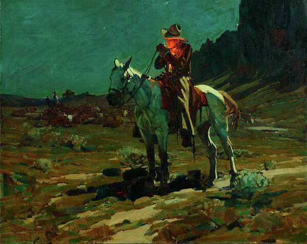
One painter whose evening painting (nocturnes) I admire is Frank Tenny Johnson.  His western nocturne's take my breath away.

Night Time in Wyoming Poster by Frank Tenney Johnson


Above the Old Mill Pond

Above the Old Mill Pond
Acrylic 12" x 16"

This painting was based on Plein Air sketches in Pen and Ink and the watercolor sketch done later in studio.  The perspective is imaginary, as though looking down from a high mill tower.  I wanted to find ways to include what was at the scene in one picture that you could see, just not all at once.

The mill is long unused.  Part of the building being used for apartments.  Part of it collapsing.  Part of it long collapsed.  The mill pond still exists, though the dam is slowly failing.  I broke the edge of the building in the foreground to allow another example of distance as well as the birch tree on the right for the same reason.

I was pleased at how this composition came together and I enjoyed trying to convey a sense of space without having any actual "sky" in the painting.  I plan to go back to this location to do an on location painting of the dam itself, before it is gone.

You may have noted that there is no chimney in the finished painting.  There wasn't actually one there, I was just experimenting in the watercolor.  I also adjusted the angle of the mill building to lead more into the mill pond rather than across it as in the watercolor sketch.

Above the Old Mill Pond Study

Watercolor Sketch - Above the Old Mill Pond

As of late, I've become more and more interested in cropping compositions differently, almost approaching the abstract.   This quick watercolor sketch is based on reality, but not exact.

I'd gone out on a Sunday morning sketch trip and revisited on old mill I'd sketched before in pen and ink.  I sketched the building from the side of the road from a much lower perspective.  The old dam, in the lower right of the composition, was also another subject of interest for me.   The mill pond was was also a point of interest that could not be seen from my original vantage point.

These sketches also took place in the winter.  I decided to imagine what the scene would look like in the fall with the reflections of trees and then how I could alter the perspective and still be true to the mill and the old dam.  So what started as a subject focused on the mill in winter, turned out very differently.  

I enjoy the process of when I am working on a painting or even when writing, that I have a clear idea of where I want to go, but the painting develops a will of its own.  This was a quick watercolor sketch that I will definitely expand into a larger more finished work.

There was an older mill across the street that I'd hoped to paint and sketch, as there were many interesting angles and designs in the decaying mill, but the last time I went back to sketch, the mill had been torn down.

watercolor sketching

I recently started experimenting with compositional sketches in watercolor.  Watercolor allows me to quickly block in a scene, experiment with color and different ideas for the subject.

The corner farm at dusk was just a quick impression I caught a glimpse of while driving home from work.   These sketches were only done in watercolor.


The second sketch of the corner farm is what it might look like as a winter scene with cornstalks as were actually there.  I changed the sky and moved the trees behind the house and moved the house further back in the composition.  I also extended the heighth of the silo.


From these quick small sketches I will continue to refine the paintings with more detailed studies (such as the corn stalks) before launching in to a finished painting.

All of these materials, a portable watercolor palette, a small water container and the watercolor paper scraps fit into a small sketch bag.  It's a quick ready to go at a moments notice.  I've put a couple of small watercolor brushes in a baggy along with pencil and charcoal should I desire to sketch in different media as well. 

Keeping these sketches "sketchy" will allow me to retain the enthusiasm necessary to continue to create and add throughout the process to the finished painting.

Ammonoosuc River #2


Ammononusuc River #2
Watercolor on Paper 
15" x 22"

This is a painting of the Ammonoosuc River in New Hampshire that I completed yesterday (in my basement - totally observing social distancing).  I will do some more studies from this to capture the water in different moods / speeds et cetera.  It's amazing how much the same "scene" can vary based on water and light reflection.

Below are studies used to work out aspects of this "final" painting and the final painting itself to give you some sense of scale.  Missing are a large (rough) pencil sketch with notes that I completed on location as well as a few pen and ink composition studies.

The top left and right watercolors were completed on location during the same trip as the pencil sketch.  The upper middle watercolor was done at home a few days ago (nearly a year later than the on location studies).    (see link below)
 Permalink
https://robertkahlerlandscapepaintings.blogspot.com/2019/05/mt-washington-and-amonoosuc-river.html


Now if, like me, you had been told that in order to execute a painting you would need to do upwards of six preparatory works (in this case a pencil sketch, 3 pen and ink composition studies, two on location watercolor paintings, and another color study) my enthusiasm for painting would have taken a nose dive.  I would have just wanted to get started.  I still prefer on location paintings started and completed in one go.

However, over time, I've worked out a method that works for me.  On location studies are what ignites my enthusiasm for painting.  The time spent on location, usually within nature, is time I cherish and that I find to be renewing.  I've written before about how amazing it is to me, that an on location painting can literally bring me back to that day even more than 20 years later.  Those paintings serve as a touchstone for memory and inspiration.

Generally I'll complete two or three on location studies per trip, generally the most detailed first, with each following painting becoming looser in its execution.  This lessening of detail occurs most likely for two reasons.  One - there is always a time pressure as light and attention both fade over time.  Two, simplifying a composition in nature is almost always necessary in order to emphasize the center of interest in the subject.

Color and Composition Study - Pemaquid


Color and Composition Study - Pemaquid ME

This study is graphite and gouache on paper - 12" x 18"   This painting is a combination of a variety of on location studies, pen and ink composition thumbnails, and represents a combination of views of the region that exist, but not exactly as in this composition.

Some quick notes from doing this study are to extend the tree on the left out of the picture, widen the gap between the river islands, and add a thin line of ocean beyond the mid ground to add some distance - that may also be another composition.  I was not too concerned with colors in this, more just trying to capture an impression.

I plan to do a large watercolor of this as well other media - oil, acrylic, and perhaps charcoal.

https://robertkahlerlandscapepaintings.blogspot.com/2020/03/composition-and-color-study-ammonusuc.html

Composition and Color Study Ammonoousuc River

I had to get out of the house for a bit yesterday.  Did a couple of quick pencil drawings of a farm outbuilding and of two huge maple trees on the farm.  For whatever reason, I seem to be going through a pencil drawing stage now.  There is something about capturing a scene in just shades of graphite that appeals to me.  Some pencil drawings are very delicate yet incongruously breathtaking and powerful at the same time (I'm not referring to my own work - yet).

Yet, this entry is actually not about pencil drawings, so I'll get back on point (pun intended).  Despite my current passion for pencil, I also regularly feel the urge to work with color, even in the design phase of my work.  So what follows is one two color and composition studies that I completed yesterday on 12" x 18" paper using graphite, gouache, and previous on location studies for reference and inspiration.

Ammonusuc River Study

I am still getting used to gouache - it seems to dry darker then when I paint it - whereas transparent watercolor tends to dry a little lighter.  Practice practice practice.  This scene was inspired by a hike (and sketch) along the river last April.  There was still ice and snow in the woods at this time and the river was running rapidly although the level had been dropping as evidenced by the trees and ice deposited along the riverbank far above the current water level.  When you see a large tree "deposited" in still standing trees fifteen feet over your head - its impossible not to be reminded of the power of nature and the respect it is due from us all.    I didn't paint those elements as I really wanted to focus on the river - but that is a subject that I will return to in the future.


Swift River March


Mixed Media
Oil over Acrylic
12" x 16"

This painting was a continuation of the painting below.  There were parts of the painting that seemed flat to me and I wanted to add some more life, color, and movement to the painting.  Here they are side by side/


Here they are side by side.  I think it works a little better now than before.


Approaching Storm


Approaching Storm
Acrylic on Canvas Board
18" x 24"

When painting a subject that is imaginary, or half memory and half imagination versus an on location painting, different challenges arise.  However, I find that each choice in painting informs the other.  Thinking quickly about the genesis of this painting - four things come to mind.  

A sketching trip to Cushing Maine, Painting trips to Evans Notch, Dunes on Cape Cod and the fields and forest that I used to play in growing up in Westbrook.  This composition is an amalgam of those experiences and more.

I've submitted this painting for consideration in an upcoming juried exhibition. This painting is one of the first that I've specifically designed for a show.  Generally I've simply matched paintings completed with the themes of juried shows.  I can't really say that I have a preference beyond painting effects and subjects that are of interest to me.

Another different thing that I've done with these past few paintings is prepping the canvas with yellow ochre and raw sienna.  that's part of the effect that you see of the reflections in the water - it is the under-painting being revealed by thinning the surface of paint.