Showing posts with label gouache. Show all posts

Rugged Coast

Rugged Coast
Gouache on Paper

This painting is a gouache on paper over pen and ink.  As I've written about before, I will occasionally experiment over earlier paintings.  The Yankee in me hates to throw anything out.  Working in Gouache is still relatively new to me.  I prefer transparent watercolor, but whatever can help me achieve what I'm trying to achieve, I'll give it a try.

I was watching one of James Gurney's video's about painting on location with gouache and he mentioned how gouache tends to dry a little darker than it appears when painting - something I found to be very true.  This painting was also over a sketch in pen in ink with a lot of shading, so that did not help.  None the less, my plan was to go for a stormy scene anyway.

The picture below shows my current method for sketching on location and even studio work where I will work out different ideas in the margins - focusing on different compostions in thumbnail sketches before attempting a finished drawing.   


In this particular instance, there are only a few compositional sketches in the margins.  In other cases, the margins will be filled.   Another advantage of this method is for on location work.  At times, I may see a subject I want to paint, with many other elements that could lead to other paitnings in their own right, or some elements for me to add to other compositions.  It's a great practice that I also find forces me to simplify my compositions.  Initially I pre-drew all the squares for composition.  I've decided against that as there are times I'd like to do portrait orientation compositions as well as landscape compositions. 

I've not reached the point where I'm doing proportial sketches to the size of the final paintings, but that is easy enough to do.
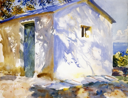
Sargent Watercolors

Corfu: Lights and Shadows by John Singer Sargent. (Watercolor on paper. 1909. Museum of Fine Arts, Boston.) Click to enlarge.


I saw a major show of John Singer Sargent's many years ago at the Boston Musuem of Art.  It included portraits and some of his work from World War One.  As is always the case, the original artworks were stunning beyond description - no matter how good the quality of reproductions.

In some cases, even in larger than life canvases - a single brushstroke "made the painting" come alive with light or shadow.

Personally, I've always been attracted to John Singer Sargent's watercolors from his travels thoughout the world.  In particular, his ability to capture a sense of light and atmosphere.  I have no idea of whether or not he ever intended to show his watercolors or if they were simply done for enjoyment or study purposes - I'm just glad that they have been preserved.

Even a mundane (or potentially mundane) subject comes to life under his brush.  A simple white building sparkles with light as seen below.


Bedouins

His ability to render whites in watercolor seems effortless - which no doubt came from years and years of study and experience plein air painting.

Like another artist I admire, Aiden Lassell Ripley, John Singer Sargent was not "stuck" on tradition. Even though much of thier commissioned work would likely be considered to be traditional, when traveling or painting for their own enjoyment, both artists painted beautiful yet substantial impressionistic watercolors.    Although the bulk of his watercolors appear to be translucent in nature, both Sargent and Ripley did utilize opaque watercolor (gouache) to achieve the highlights they desired.  It was the effect that was important - not the rules for getting "there."

Courtney Allen

One of the reason I love ducking into antique stores is that you never know what you are going to find.

My introduction to art was primarily though the illustrators of the golden age through my wife's family of artists as I wrote about here.  Inspiration better late than never

I came across this illustration study for a dust jacket by Courtney Allen a couple of weeks ago and I picked it up earlier today..


This painting was a preliminary study for the book cover for the book "Gold Mountain" by Charlotte Paul issued by the Peoples Book Club of Chicago in 1953.

It's roughly 9" x 12" and appears to be ink and watercolor/gouache.  Historical interest aside, I love the freedom and confidence of the execution of this painting.  One of the things that I enjoy about these types of paintings is that you can see the artists thought process.  How the eye is led into the center of interst - the figures disembarking in search of gold and , perhaps, a little romance.

I look forward to finding the original / finished dust jacket to examine the differences between these initial paintings and the final "product."  

Courtney Allen was a contemporary of my wife's great uncle (Charles La Salle) and the two most likely knew one another professionally as well as personally.  They were both friends and colleagues of the top illustrators in the country including Norman Rockwell.  They both lived and had studios in New Rochelle in the early 20's and worked for the major magazines of the day including Cosmopolitan, Colliers, The Saturday Evening Post, This Week, and True magazines to name a few.

I look forward to learning more about Courtney Allen and his life and career.